
Why Colours Matter & How to Choose Your Brand Colours
by EnyOsung
This is guest post by Anna Carter. I chose to publish it on here because I know that branding is a crucial part of marketing any business’s products and services. Furthermore, your brand colours play a critical role in how potential customers see your business. Read on to find out
Why Colours Matter & How to Choose Your Brand Colours

Whether you’re branching out from an existing company or launching a start-up of your own, understanding the impact that colour can have on customer perception will ensure that your brand is a success. Take Heinz as an example.
Just ten years ago, large-scale condiment-manufacturer Heinz launched a brand new product that became an immediate success. It was so successful, in fact, that when supermarket stocks ran low, buyers were auctioning the item on eBay to get a hold of it. What was so enticing about Heinz’s new ketchup? It was green.
The very fact that this new ketchup was green sent its sales skyrocketing. It wasn’t different from or superior to red ketchup in any other way – not in taste, value or shelf-life. It was, quite frankly, just green.
Crystal Pepsi, on the other hand, a clear-coloured variant of the original, dark-coloured soft drink, was a complete failure. It performed so poorly that sales barely lifted off the ground and the product was discontinued after 12 months.
What’s the underlying message here? It isn’t that your product should be green, nor should you steer well away from clear-coloured products.
The message I am delivering is that colour matters. It matters a lot. So much, in fact, that the very colour of your product, brand or company artwork could make or break its success more than any other factor.
Why Colours are Important for Your Branding
It’s no doubt that colour is a vital component of brand success. In fact, studies have proven that 85% of potential customers exalt colour as the biggest motivator when choosing whether or not to buy a product.
Below are some design tips to help you to choose an effective, relevant and recognisable colour palette for your brand.
Colour Sparks Emotion
Colours are powerful.
The very sight of a particular colour such as blue can evoke feelings of stability, serenity and trust, while others, like red, can encourage rapid and impulsive decision making. All colours can, and do, affect the success of a brand depending on the emotions that they bring about. If your brand sparks a sense of urgency in potential customers, they are far more likely to invest in your products than if made to feel relaxed and content.
The effects of colour on the state of mind are well documented. World-renowned colour theorist, Faber Birren, wrote extensively about the connection between colour and emotional state in his book, Color Psychology and Color Theory.
As Birren explains, just as the word ‘love’ sparks completely different emotions to ‘candlestick’, colours like red, blue and green create different responses, too.
These differences also apply to varying shades of colour: a light blue may evoke feelings of serenity while deeper tones can symbolise sadness.
More interestingly, differing responses to varieties of colours are often, Birren found, universal. Though some cultural variations occurred, generally, colours created similar responses in people from all over the world. Blue made people feel calm from one side of the earth to the other.
The First Point of Judgement
Visual perception and awareness is our primary sense for navigating, exploring and assessing our environment. For that reason, many of our judgements are based upon appearance rather than other factors.
According to the Institute for Colour Research, 62-90% of our appearance-based-judgements are formulated due to colour alone. Nothing else.
Colours can trigger a multitude of thoughts, feelings and responses within milliseconds, without conscious awareness. It is crucial, therefore, that your brand’s coloration is designed to evoke emotions that maximise its success.
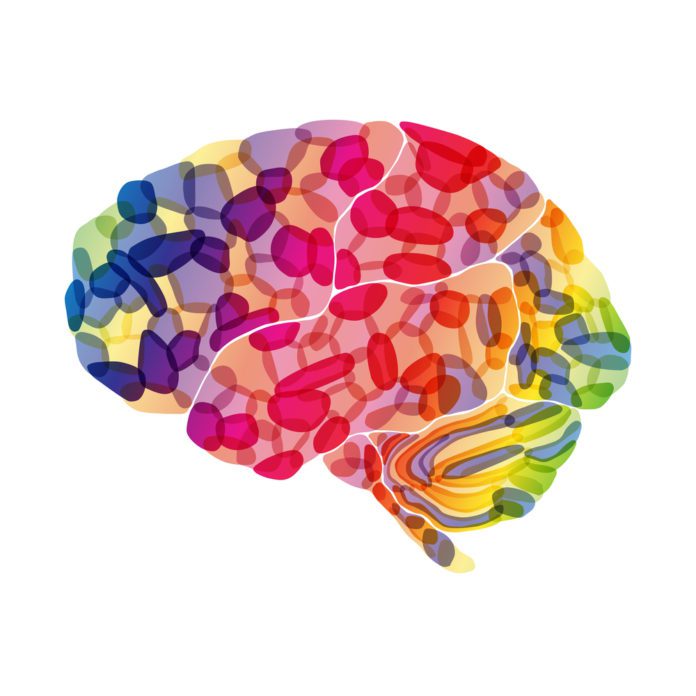
How Colour Affects the Brain

Swiss psychiatrist, Carl Jung, believed that people have deep, special connections with colours. “Humans have universal, bodily responses to colour stimuli,” he claimed, “colours are the mother tongue of the subconscious.” His ideas, spiritual as they may sound, paved the way for a multitude of scientific studies into the psychology behind colour.
As has since been discovered, colours give rise to a diverse range of responses within the cerebral cortex of the brain. Scientists attribute these emotional tendencies to evolution. As written in the Proceedings of the National Academy of Sciences of the USA, “Sometimes colours send an ‘approach signal’ (e.g. the colours of a flower attracting pollinating insects), and sometimes they send an ‘avoid signal’ (e.g. the colours of a poisonous toad deterring predators).”
As soon as a colour is identified, in fact, chemical reactions spark inside our brains that give rise to emotional responses. Oftentimes, we aren’t even aware that judgements are being formulated. They are governed very commonly by tiny little signals bouncing around our cerebral matter.
In the context of branding, colours may send signals to a person’s brain telling them either to purchase a product and steer well away from it. It is, therefore, vital that your colour scheme entices and attracts potential customers to invest in your brand. Colours such as red, blue and green can evoke positive emotions in viewers that encourage them to make purchases, while others, like black and dark yellow, can be off-putting and have the opposite effect. (See “How Individual Colours Evoke Different Responses” for more on different colours and their effects.)
How Different Wavelengths Create Different Emotions

In reality, ‘colour’, is nothing more than a construct of our society. Our optic nerves have evolved to detect certain frequencies of light, and these frequencies cause us to see different shades of colour for which we have assigned values and labels. Within this spectrum of light, however, deeper emotional responses can be triggered. Longer wavelengths such as red can trigger faster responses in the brain whilst shorter wavelengths like blue can be calming and soothing.
Colour can have a significant impact not only on the way we feel but also how our body functions. So much so, in fact, those shorter frequencies have even been shown to lower blood pressure in some cases.
Identity and Familiarity
A study entitled “Exciting Red and Competent Blue” found that colour can impact the success of a brand in other ways, too. The authors of the study showed that colour and typography can alter brand personality and purchase intent by effecting familiarity. For example, big, bold yellow lettering effectively represent IKEA, whilst Apple customers rely on sleek, black and white imagery to identify the brand. Without these predictable characteristics, such brands would be far less recognisable and would lack personality. If designed appropriately, colouration can enhance the familiarity of brands and effectively shape its identity.
What do the Statistics Say About Branding Colours?
Following on from Jung’s hypothesis, a wealth of scientific studies have now been conducted, providing innumerable statistics based on colouration and brand success.
Below are some statistics about colour:
- A signature colour can increase brand recognition by 80%.
- 33% of the top 100 brands use blue in their logo, 29% use blue and 28% use black or grayscale colours.
- 90% of all purchasing choices are made subconsciously and based upon emotional responses, often triggered by colour.
- 62-90% of appearance-based judgements are formulated due to colour alone.
- Up to 90% of snap judgements made about products are based upon colour alone.
How do Colours Influence Brand Perception?
As discussed earlier, different colours can significantly influence the way that a brand is perceived. But colour doesn’t always affect all people in the same way.
Some subgroups and cultures may derive different meanings from the same colour.
How Individual Colours Evoke Different Responses
With the exception of the cultural variations discussed previously, Faber Birren’s findings were correct. Particular colours are widely known to evoke the same responses amongst different groups of people.
Let’s talk through these.
Red: Red is a very emotionally intense colour. It has been known to enhance metabolism, increase respiratory rate and raise blood pressure. Red stimulates feelings of passion and excitement, often creating a sense of urgency and impulse within people. In a branding sense, red may encourage a potential buyer to make quick purchasing decisions without much contemplation.
Many large brands make use of the colour red for this reason. Coca-Cola, KFC and Nintendo all use red in their logos. Brands like Netflix, YouTube and Adobe contrast red with white, creating bold, striking artwork where red is the focal point. Red should be used as an accent colour and to stimulate quick decision-making; it’s perfect for colouring imperative statements, too, like ‘Buy now!’ or ‘Click here’. Red is also great for promoting activity-related products, as it symbolises energy and impulse.
Blue: Blue has long been linked to feelings of serenity and peace. Blue is the colour of the sky and the sea and is often associated with depth and stability.
In contrast to red, blue has been shown to slow down human metabolism and lower blood pressure, relaxing both mind and body. Meditation companies such as Calm harness blue’s soothing powers to represent their brand’s personality and identity.
Blue has several non-emotional connotations, too, often used to depict cleanliness, health and aquatics. Lighter blues are best suited to promote products related to sanitation, water, stability and relaxation. Unlike emotionally warm colours such as red and orange, dark blue better depicts intellect and consciousness. It works well when promoting precision and accuracy in tech-related products. Lastly, blue should not be used when promoting food and cooking as it is known to suppress appetite.
Green: Green is commonly associated with earth and nature. It symbolises life, growth and fertility, as well as safety and health. Known to heal and improve vision, green is a restful colour with strong positive connotations. Green is also linked with hospitals and medicine. Green can be used to indicate safety when advertising medicinal products. It is also great for promoting environment-related ventures, such as ‘green’, eco-friendly products. Duller, darker greens may better-suited to money-related products as they reflect colours of cash notes.
Yellow: The colour of sunshine, yellow is a happy, positive hue commonly associated with joy and intellect. Generally, yellow has a warming effect, arousing cheerfulness, stimulating mental activity and generating muscular energy. Bright yellows are effective in catching people’s attention, which is why many warning signs and taxis display lettering in bold, yellow tones.
Due to its pleasant, positive nature, yellow can be used when promoting children’s products and any object linked to leisure.
Yellow is often received as a light-hearted, playful colour and usually isn’t appropriate when advertising prestigious, high-end products. In contrast to blue, yellow evokes spontaneity rather than stability and should not be used when promoting safety-related products. In combination with black, however, yellow can effectively be used to display warning notices. Overuse of yellow can, however, have a disconcerting effect; it is known that babies cry most frequently in yellower rooms. Furthermore, dark yellow can depict dirtiness and poor hygiene, hence why lighter tones are more frequently used.
Orange: A combination of the qualities of both red and yellow, orange amalgamates energy with light and positivity. Orange can effectively represent happiness, creativity and stimulation. Orange and red are often used to depict heat, though orange is softer and less aggressive than red.
Known to increase oxygen supply to the brain, orange can stimulate mental activity and promote action. In heraldry, orange evokes strength and perseverance. Orange is a very visible colour. It can be used to attract attention to particular areas of a design. It is also effective in promoting products related to concentration, happiness and intellect.
Purple: Merging the stability of blue with the stimulation of red, purple evokes power and luxury. Purple is often associated with wealth and affluence, as well as wisdom, independence and mysticism. Many young children take a strong liking to the colour purple, with almost three-quarters of pre-adolescents favouring purple over any other colour. Light purples are feminine and can be used to promote products that you intend to sell to women. Darker tones can evoke gloom and sadness, as well as anger and frustration
Black: Black is commonly associated with power, mystery and death.
It is often considered a very elite, prestigious colour (black suit and tie, cars etc.) used to denote formality. Black foreground colours can present as bold and striking, yet minimalistic at the same time.
Black backgrounds can be used to make foreground colours stand out (such as white on black). In combination with white, black can also be used to effectively create a simplistic, minimalist colour scheme.
White: In Western culture, white evokes purity and sanctity, while in China, white can indicate death. White often depicts cleanliness and safety, too. In direct contrast to black, white generally has strongly positive connotations, depicting faith and perfection. White can be used to denote simplicity, as well as coolness and cleanliness. Used commonly by charitable organisations, white represents angelic, divine ideals and can denote goodness and benevolence.
Choosing the Right Colours for Your Brand Image
There is no doubt that colour is crucial to the success of a brand.
But how exactly can an entrepreneur, manager or salesperson make the most of the above information and choose a colour that will maximise their brand’s success?
Take the Challenge
Research clearly shows that colour can influence our decisions in many ways, but it doesn’t take an artist to select a colour scheme.
As Leslie Harrington, author of a Ph.D. entitled ‘Color Strategy: Leveraging Color to add and Extract Values for Products and Brands’, writes: “Colour has been one of those things that have been left up to the designer to select something. The CEOs or management say ‘Oh, I can’t do that, I’m not artistic enough.’ But my argument is that it’s not about being artistic – it’s not any different than making any other strategic decision for your business.”
And she’s correct. With the right pointers in mind and some careful consideration, anybody can decide on their brand’s colour scheme, without having to employ an artist. “It doesn’t cost you any more to make the right colour decision for your product,” writes Harrington, “But if you choose the wrong colour, from the onset, you’re not going to communicate what you want to your customer.” Simply put, your brand colouration is a heavily weighted decision. It doesn’t take an artist, but it certainly does require research, time and consideration.
Identify Your Focus
What’s the primary focus of your brand?
Is it to generate leads? Drive sales? Increase your mailing list?
Your brand’s goals and aims should be the driving factors in determining which colour scheme to select.
By ensuring that these colours align with the fundamental objectives of your brand, you will maximise its success by evoking emotion and promoting brand recognition.
Brands such as Virgin and Coca-Cola adopt bold, red colour schemes because their primary aim is to generate sales. Red, as discussed earlier, encourages rapid decision-making. Richard Branson and Muhtar Kent leveraged these facts to maximise the success of their businesses.
And you should do the same. Identify your goals and ensure that these align the colours that you select to represent your brand.
Know Your Identity
Colour is an incredibly powerful way to shape your brand’s identity.
Companies such as Facebook and HP use passive blue tones to symbolise stability, intellect and freedom. Their colour schemes effectively reflect what that particular brand is about; what it represents and how customers can benefit from it. It’s crucial that your colour scheme aligns with the personality of your brand. This will enhance its familiarity, maximising its long-term success by promoting recognition. Consider how you’d like your brand to be perceived by those viewing it and ensure that your colour scheme matches these desires.
Conclusion
Whether you’re creating a product, launching an app or designing your brand’s artwork, the colour scheme you choose to adopt could significantly impact its chances of succeeding. With the right tools and careful consideration, you can ensure that you get your colour scheme right the first time.
*********************************************************************************************************************
Global.Media provides expert online and offline advertising, and marketing on all digital platforms to get qualified leads for businesses. Check out our Services page to see how our advertising and marketing services can help your business to get more customers and sell more, faster. Why not sign up for our newsletter using the simple form on the right? You can also follow us on social networks. Finally, we’d love for you to share this post with your network using the share buttons below.
********************************************************************************************************************
We’d love to have your feedback and suggestions about this post. How have colurs affected perceptions of your business? Which colours have helped or hindered your sales? Please leave your comments in the Comments Section below.
Other posts you may like
10 Strategies for Facebook ads that Convert- Marketing Magic Tips
Do I really need an SSL certificate?
The Secrets of Great Marketing – Marketing Magic Tip
Top 5 Ways Digital Marketing Is Important For Your Business
Our Digital Marketing Services:
Website Design | Search Engine Optimisation (SEO)| LinkedIn Marketing | Content Marketing| Email Marketing| Pay-Per- Click| Social Media Marketing| App Development & Marketing| Business podcasts | Video marketing
HOME | ABOUT | MaAD BLOG | PODCASTS | TESTIMONIALS
Download Our Mobile App to listen to our podcasts on the go Get Mobile App
Recommended Posts

Eny talks with Lydia on The Joyful Path Podcast
9th December 2022

How to use new LinkedIn Campaign Manager
20th July 2022